SOSD Rebranding
Visual Identity Rebranding of
Save our Stray Dogs.
Visual Identity Rebranding
Individual Platforms,
NUS DID, 2020
NUS DID, 2020
I chose to give Save our Stray Dogs (SOSD) a visual identity rebrand for my academic design project.
Animal shelters in Singapore face manpower and land constraints, yet the number of strays continue to grow. Awareness is needed for everyone to work together to reduce such animal suffering.
With SOSD’s redesigned identity, I hope to weave a better emotional connection between their cause and the general public, while inspiring empathy through being a humane society
Current Identity
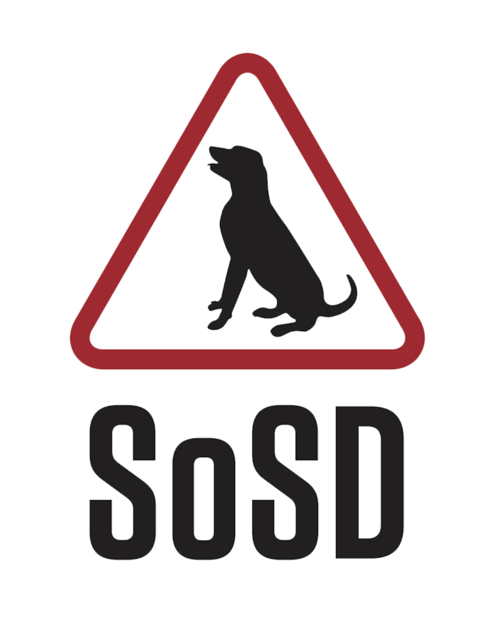
Save Our Street Dogs, SOSD, is a volunteer-run animal
welfare organisation located in Singapore.
The existing logo fails to resonate with their humanity towards stray dogs. Due to its similarity in form with road signs, the red used in the logo signals danger instead of empathy. The dog silhouette is too specific to represent all stray dogs, furthermore it is trapped in z
the triangle.
My aim is to give SOSD’s identity a better connection with their mission in saving strays and strengthen their empathetic qualities.
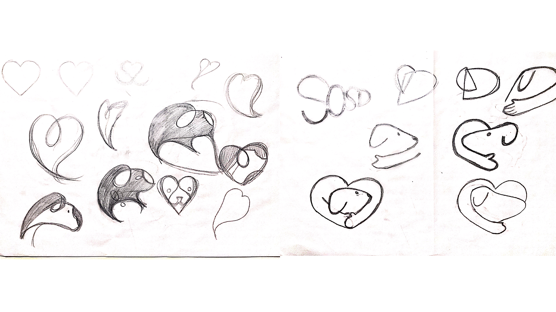
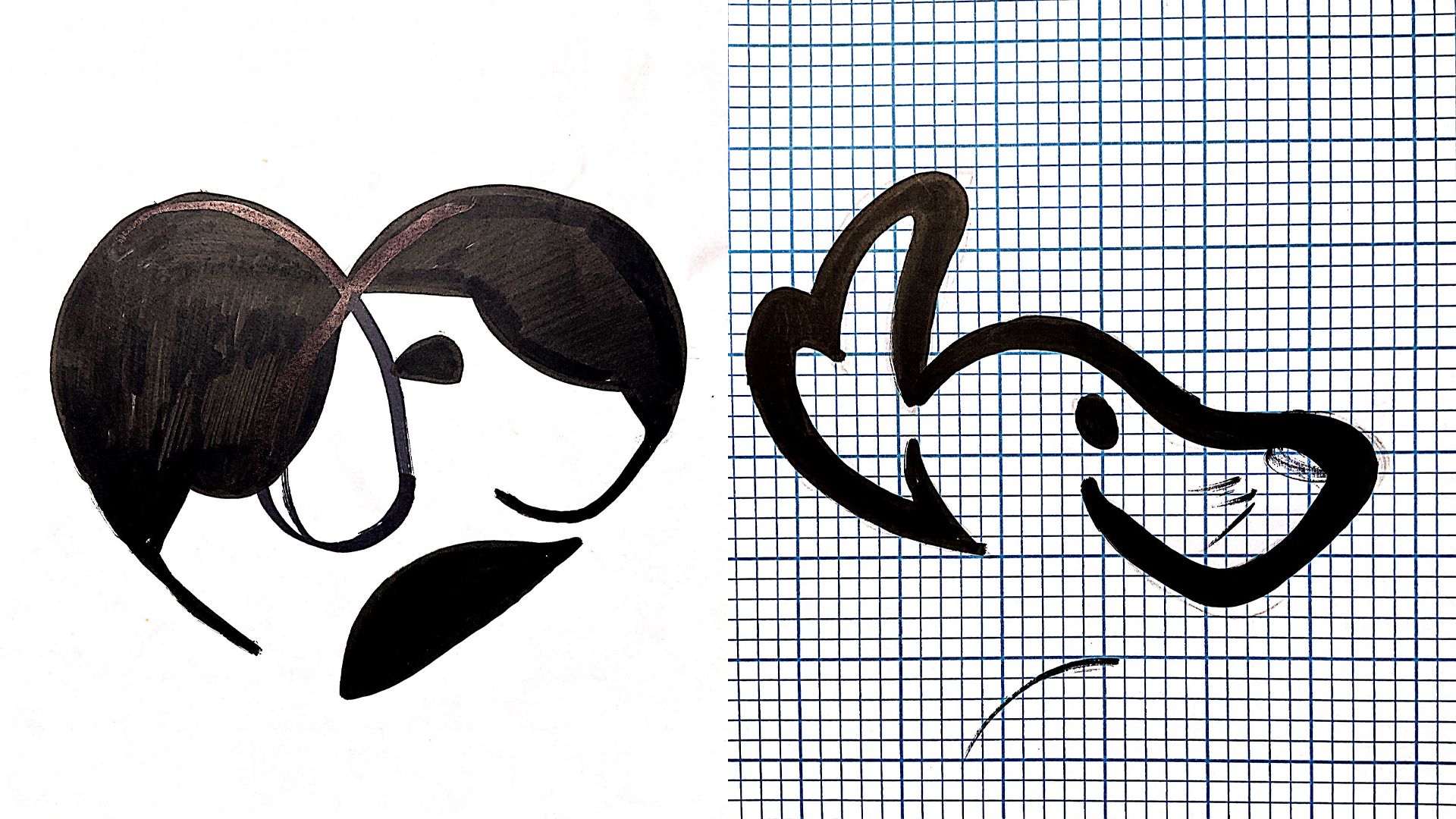
Sketch progression

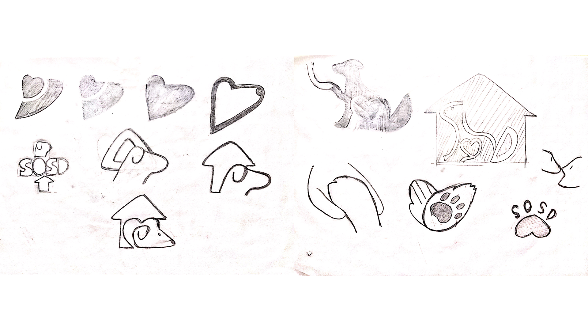


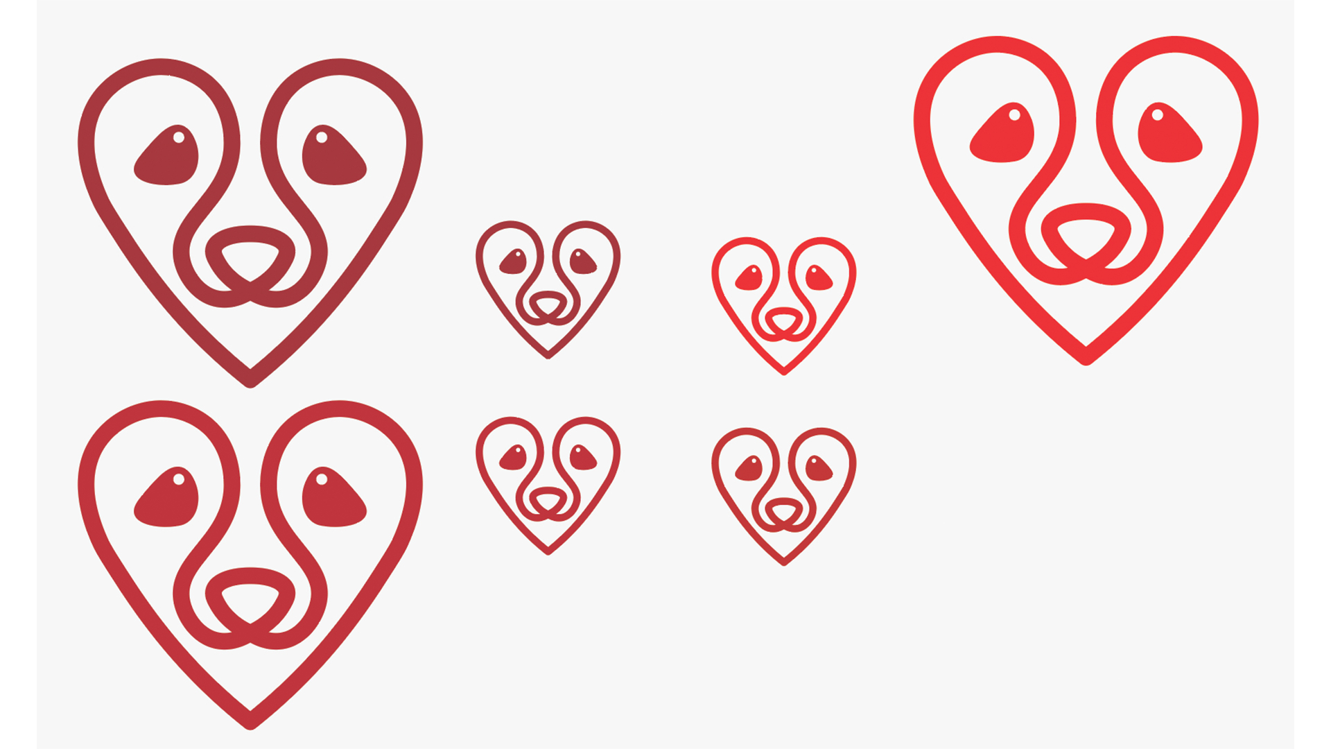
Logo Concept

The redesigned identity is a visual synthesis of a heart and a canine face.
The continuous heart line merges into the dog represents the integration of strays back into a loving environment.
The mark aims to reinforce the empathetic mission of SOSD. When displayed in any form, its purpose is to communicate intentions of care and enable trust.
The compact heart shape also makes it easier for the public to recgonise the organisation as a humane animal society. Due to its universal heart geometry, the form would still be identifiable even if the mark is slightly hidden.

The common facial characteristics of a canine represents all breeds of dogs,
showing inclusion.
The direct ‘puppy eye’ contact towards the viewer bridges a familiar connection, implying the positive and empathic relationship between humans and dogs.
showing inclusion.
The direct ‘puppy eye’ contact towards the viewer bridges a familiar connection, implying the positive and empathic relationship between humans and dogs.

Red is universally used to express love. Likewise, the usage of the colour here evokes an empathetic connection for stray dogs.
Identity Applications
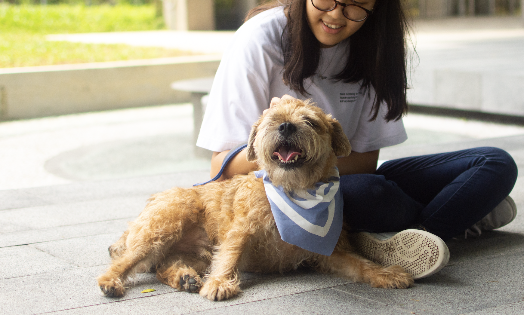
Dogs are often brought out for adoption drives.
To easily identify them, bandanas and leashes can be used. The colours go by blue and pink to differentiate their genders in a clearer way to the public.
Half the mark covers the bandana as the dog completes the look with its face. Such outfit sets makes the dogs more appealing and possibly raise adoption rates.

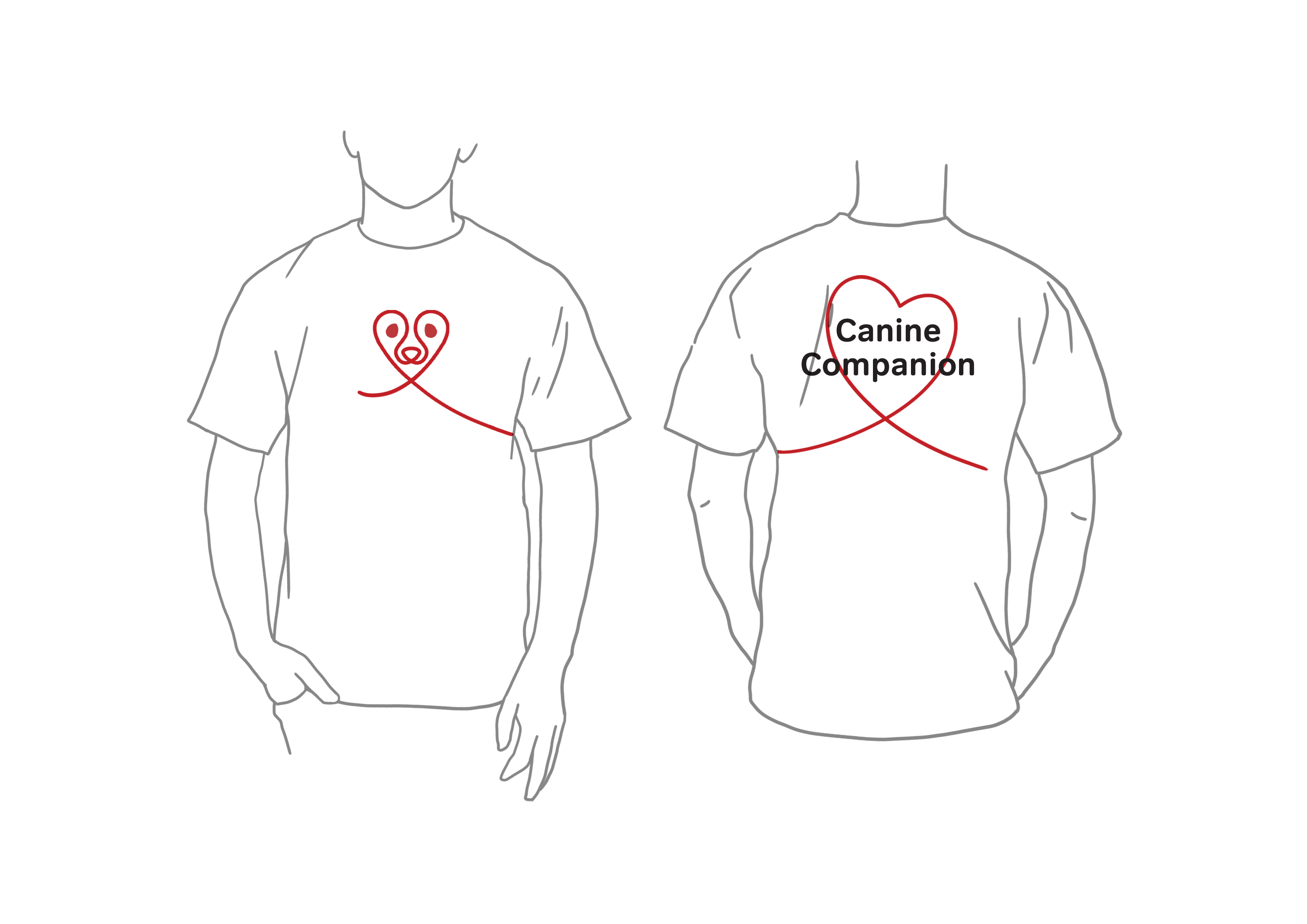

Volunteers are the people who have helped
maintain SOSD’s advocacy and missions. They
are the dogs’ best friends and foster a special
bond together.
As the frontliners of rescue and outreach, their apparel reflects their role in SOSD: caring, passionate Canine Companions.
As the frontliners of rescue and outreach, their apparel reflects their role in SOSD: caring, passionate Canine Companions.
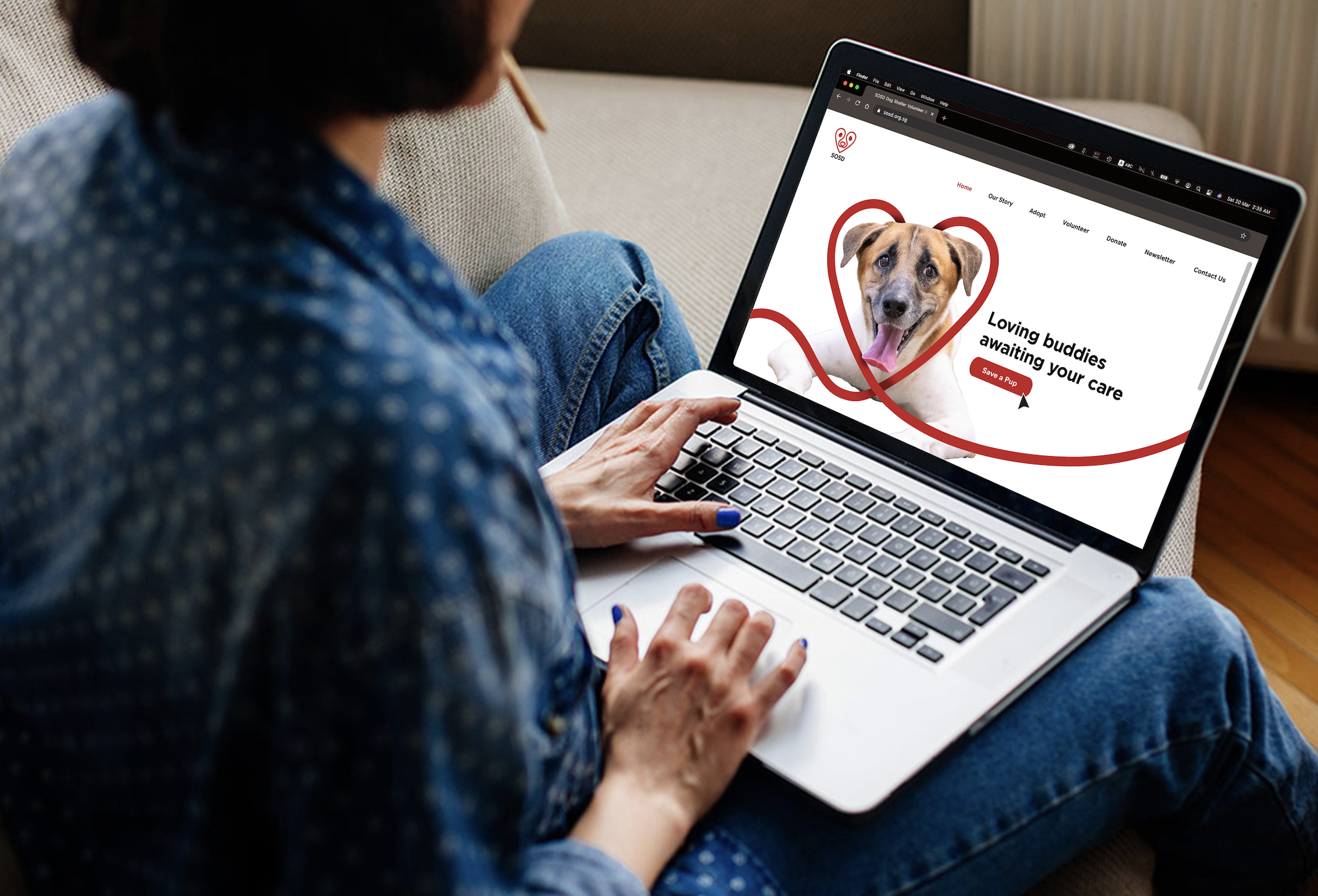
For a wider outreach, SOSD’s website serves as a platform where keen adoptees and volunteers can visit to connect and learn about the organisation as well as take part in their cause.
The interface is easy to read, allowing people of various ages to navigate smoothly.
Concept Photo Shown
The interface is easy to read, allowing people of various ages to navigate smoothly.
Concept Photo Shown

 Concept Photo
The shelter is home to rescued stray dogs, a safe haven for them to rehabilitate.
The mark is expanded for the conceptual shelter signage to signify its warm and caring environment for the stray dogs to potential walk-in adopters. Rescuers would be able to connect with the shelter mark as a sign of shelter, regardless of whether they are familar with SOSD.
The mark is expanded for the conceptual shelter signage to signify its warm and caring environment for the stray dogs to potential walk-in adopters. Rescuers would be able to connect with the shelter mark as a sign of shelter, regardless of whether they are familar with SOSD.